(Continue from yesterday's post)
Well, did I succeed? I wandered around the children's section the size of a football pitch and noticed a small girl in a halter top reading a comic book. As the time-tested popular draws in any image are repetitive patterns and symmetry, what intrigued me for the scene was, besides the back of the little girl, the patterns repeated by the books. The colours look pleasant and conforming too.
But without a frontal glimpse of the subject, the shot lacks punch. The image cannot reflect any unique aspect of the theme Readers Reading, which I knew in the next second and therefore moved on.

Then I came across two young readers sitting on the floor reading. I am not a feet fetishist but the curves of the four skinny legs simply held my interest. But how could I relay the image to the theme? I tested a shot including only the young chaps and the shelf behind them in the image. (Later on, I experimented the same for the two adutls behind the book shelf.) But that was too casual a shot. And the two readers looked confined in space, certainly not an interesting aspect of reading.
So I retracted the lens back to include in the shot the two standing adult readers and a more extensive background. The image somehow has an atmosphere about readers being engrossed in reading. The information is richer; young readers, mature readers, reading in different positions, the setting of a bookstore. But the problem is, there is too much information in the image.
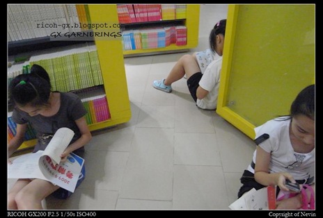
By this time, I almost called off the bookstore shootout. The one last shot was back to step one: making use of repeative patterns in an image. So I came up with the last photo with three girls sitting in a near-triangular space formed by three bookselves. The outcome is interesting but far from a choice for a photo contest.
So photography is an activity charcterised by choices from the moment you think up a theme to when you sieve through the photo for the keepers.
Back to the photo contest. As far as my experience goes, the winning images in most photographic competitions are coincidentially chosen for some similarly distinctive features: they reproduce the gist of an interesting aspect related to the theme with a crisp compostion and the truly essential information. Of course, the light has to be right. So, I ended up with not a good photo from my bookstore adventure. It was then an old image flashed across my mind, which somehow conforms to those distinctive features.
I titled it "The Curious Heads of Reading" (below) and submitted it to the Ricohforum.com photo contest for July.
(Postscript: Of course, the fellow contestants hae produced a lot of great works too. Any one of us can win. But if you think that mine is worthy of your vote, the voting will take place on 1 August for seven days. The voting thread will show here in due course. Thank you in advance for your vote :) .)


Comments